Creating Twitter Bootstrap Widgets - Part I - Anatomy of a Widget
Creating Twitter Bootstrap Widgets - Part II - Let's Assemble
Creating Twitter Bootstrap Widgets - Part IIIA - Using Dojo To Bring It Together
Twitter Bootstrap currently is the most popular open source responsive CSS framework. If you are using Bootstrap strictly as a responsive framework, you are missing out. It is also a great framework for creating UI widgets and UI components. Bootstrap normally comes with JQuery plug-ins widgets like buttons, inputs, and drop-down menus. You can use these plugins as a basis in creating more complexity widgets.
In this five part series, I will walk you through the process of creating a Bootstrap widget by first understanding how Bootstrap widgets are structured, how to layout a widget, tie it together using Dojo, turn it into a responsive widget, and how to create it as a XPages custom control for you XPagers out there. There are three prerequisites to continue, you need to have a good understanding of CSS especially CSS3, you need to know Dojo, and have created Dojo classes using dojo.declare. We will be using Dojo 1.52 and if I have time Dojo 1.83 AMD.
Many developers like JQuery since it simple to understand and use. However for our complex projects, Dojo is a better option especially when most of our iPhora Framework currently uses Dojo 1.52. When I looked into creating Bootstrap widgets, my goal was to replace the Dojo Dijits will a simpler and lighter weight widget architecture. I had already created my own widget architecture but I was having issues in maintaining it. By using the Bootstrap CSS and widget architecture, I now not only have a simpler widget architecture, but I also can create widgets that are responsive to changing screen size.
Widgets with Bootstrap takes significant advantage of HTML 5 and CSS3 allowing you to use it both for the desktop and mobile environments. The key to creating Bootstrap widgets is having a good understanding of the core and responsive versions of the Bootstrap CSS, bootstrap.css and bootstrap-responsive.css. It is extremely powerful and gives you tremendous flexibility while minimizing the amount of JavaScript code that you need to make the widget function within your application.
With the aid of the core Bootstrap CSS, you can create countless types of widgets without too much coding. The first step is to look at the structure of a Bootstrap widget. Bootstrap widgets can be divided into four core components just as any type of JavaScript widgets:
These components are combinations of standard HTML elements or groups of standard HTML elements that is assembled together and styled as a component using the Bootstrap CSS. Dojo Dijit also does this, but not to the extent as Bootstrap widgets. Dojo Dijit whom are used in XPages mostly restyles a standard HTML element using the Dijit themes. Bootstrap rely heavily on wrapper div and span elements to generate the visual layout of a widget. By combining these four types you can create any types of widgets ranging from listboxes, drop-down menu to complex visual grids. The goal of this tutorial is to walk you through the process of creating a Bootstrap combo box using bootstrap components and tie it all together using Dojo. In our tutorial, we will be creating a combo box. Bootstrap does come with a combo box, but in my opinion it is very ugly as shown in the image below.

So I decided to use basic bootstrap components to create a much more stylish combo box to my liking as shown.

So lets start. A typical INPUT element looks like:

However, with a bit of style of CSS from Bootstrap, the INPUT element now looks much nicer.


But with Bootstrap we can further enhance the INPUT tag by adding wrapper HTML elements to improve the visual aspect of the INPUT element or any type of standard HTML elements. For example:

You get:

By adding the span tag with the class "add-on" with "%", the user visually understands the type of information that is expected. There is no validation of information, but by adding the span tag after the input tag within a div tag wrapper, the user now understands that they are expected to input a number. The class "span2" defines the width of the INPUT element which we will address when we talk about responsive widgets. Using JavaScript and Regexp we can create client validation. The wrapper class of "input-append" tell the browser that you want to append the visual queue after the input tag. You can add these visual queue in front or after the input. They can be characters like % or $, icons, or even buttons, Now lets expand on this widget by adding an icon instead of character. In this case, we want to let the user know that we are expecting them to input an email address.

You get:

Visually is better to append it to the front of the input tag for an email address input field. We add an icon by adding an i tag with a class of "icon-envelope" instead of a character. Bootstrap comes with a variety of icons through the Glyphicons that are included as part of the Bootstrap assets. There is a number of other open source icons that are available including FontAwesome http://fortawesome.github.io/Font-Awesome/.
The class "input-prepend" tells the browser that the visual queue will be in front of the input tag. Beside characters and icons we can also include buttons that have characters or icons. So lets append a button with caret to the input as it would be in a combo box.
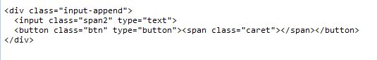
By adding a span tag with the class "caret" we now have a drop-down caret in the button. We could have had added an icon using the i tag also. So now we have what looks like a combo box However, we do not have a drop-down to make a selection. So we have to create the drop-down list. We could use standard select tag but that would not be consistent and it would not look very good. We can create the drop-down by using the core Bootstrap list component that you can use to create listboxes, navigators, drop-down objects and etc. So next time, we will talk about the anatomy of the basic bootstrap list component and add it to our combo box widget to create the drop-down portion of our combo box and follow up later with a bit of Dojo to create our widget.
Creating Twitter Bootstrap Widgets - Part II - Let's Assemble
Creating Twitter Bootstrap Widgets - Part IIIA - Using Dojo To Bring It Together
Twitter Bootstrap currently is the most popular open source responsive CSS framework. If you are using Bootstrap strictly as a responsive framework, you are missing out. It is also a great framework for creating UI widgets and UI components. Bootstrap normally comes with JQuery plug-ins widgets like buttons, inputs, and drop-down menus. You can use these plugins as a basis in creating more complexity widgets.
In this five part series, I will walk you through the process of creating a Bootstrap widget by first understanding how Bootstrap widgets are structured, how to layout a widget, tie it together using Dojo, turn it into a responsive widget, and how to create it as a XPages custom control for you XPagers out there. There are three prerequisites to continue, you need to have a good understanding of CSS especially CSS3, you need to know Dojo, and have created Dojo classes using dojo.declare. We will be using Dojo 1.52 and if I have time Dojo 1.83 AMD.
Many developers like JQuery since it simple to understand and use. However for our complex projects, Dojo is a better option especially when most of our iPhora Framework currently uses Dojo 1.52. When I looked into creating Bootstrap widgets, my goal was to replace the Dojo Dijits will a simpler and lighter weight widget architecture. I had already created my own widget architecture but I was having issues in maintaining it. By using the Bootstrap CSS and widget architecture, I now not only have a simpler widget architecture, but I also can create widgets that are responsive to changing screen size.
Widgets with Bootstrap takes significant advantage of HTML 5 and CSS3 allowing you to use it both for the desktop and mobile environments. The key to creating Bootstrap widgets is having a good understanding of the core and responsive versions of the Bootstrap CSS, bootstrap.css and bootstrap-responsive.css. It is extremely powerful and gives you tremendous flexibility while minimizing the amount of JavaScript code that you need to make the widget function within your application.
With the aid of the core Bootstrap CSS, you can create countless types of widgets without too much coding. The first step is to look at the structure of a Bootstrap widget. Bootstrap widgets can be divided into four core components just as any type of JavaScript widgets:
- Input
- Button
- List
- Display
These components are combinations of standard HTML elements or groups of standard HTML elements that is assembled together and styled as a component using the Bootstrap CSS. Dojo Dijit also does this, but not to the extent as Bootstrap widgets. Dojo Dijit whom are used in XPages mostly restyles a standard HTML element using the Dijit themes. Bootstrap rely heavily on wrapper div and span elements to generate the visual layout of a widget. By combining these four types you can create any types of widgets ranging from listboxes, drop-down menu to complex visual grids. The goal of this tutorial is to walk you through the process of creating a Bootstrap combo box using bootstrap components and tie it all together using Dojo. In our tutorial, we will be creating a combo box. Bootstrap does come with a combo box, but in my opinion it is very ugly as shown in the image below.
So I decided to use basic bootstrap components to create a much more stylish combo box to my liking as shown.
So lets start. A typical INPUT element looks like:
However, with a bit of style of CSS from Bootstrap, the INPUT element now looks much nicer.
When you place you focus into the input field, it will automatically highlight, all without any JavaScript code.
But with Bootstrap we can further enhance the INPUT tag by adding wrapper HTML elements to improve the visual aspect of the INPUT element or any type of standard HTML elements. For example:
You get:
By adding the span tag with the class "add-on" with "%", the user visually understands the type of information that is expected. There is no validation of information, but by adding the span tag after the input tag within a div tag wrapper, the user now understands that they are expected to input a number. The class "span2" defines the width of the INPUT element which we will address when we talk about responsive widgets. Using JavaScript and Regexp we can create client validation. The wrapper class of "input-append" tell the browser that you want to append the visual queue after the input tag. You can add these visual queue in front or after the input. They can be characters like % or $, icons, or even buttons, Now lets expand on this widget by adding an icon instead of character. In this case, we want to let the user know that we are expecting them to input an email address.
You get:
Visually is better to append it to the front of the input tag for an email address input field. We add an icon by adding an i tag with a class of "icon-envelope" instead of a character. Bootstrap comes with a variety of icons through the Glyphicons that are included as part of the Bootstrap assets. There is a number of other open source icons that are available including FontAwesome http://fortawesome.github.io/Font-Awesome/.
The class "input-prepend" tells the browser that the visual queue will be in front of the input tag. Beside characters and icons we can also include buttons that have characters or icons. So lets append a button with caret to the input as it would be in a combo box.

By adding a span tag with the class "caret" we now have a drop-down caret in the button. We could have had added an icon using the i tag also. So now we have what looks like a combo box However, we do not have a drop-down to make a selection. So we have to create the drop-down list. We could use standard select tag but that would not be consistent and it would not look very good. We can create the drop-down by using the core Bootstrap list component that you can use to create listboxes, navigators, drop-down objects and etc. So next time, we will talk about the anatomy of the basic bootstrap list component and add it to our combo box widget to create the drop-down portion of our combo box and follow up later with a bit of Dojo to create our widget.
Comments